Wednesday, December 10, 2014

Laura Eats Food


I am no chef, but I was ridiculously pleased with this smoothie. 

Friday, November 7, 2014

The House of the Scorpion: A Retrospective and Other Things (Part 2)

It is finished!

And.....it actually looks nothing like the horrific colors I was attempting to do at the end of the last post.

Which I am TOTALLY OKAY with.


For some reason, it looks way better on this screen than in Photoshop. 

I am quite pleased with the final result. Not ecstatic, being the nit-picky artist that I am. But still pleased. Maybe someday I'll go back and refine it a bit, but right now, I like it. 

The important thing, though, is that I learned a LOT from this project. And, oddly enough, also the Intro to Computer Art class I'm taking. In conjuction. At the same time. 

See, I've never been the best with digital art. So, when I started this project, I'm not quite sure why I thought it would be a great idea to do the whole thing digitally. I think, initially, the idea was that I would scan in the lineart, clean it up, get an idea for color, and then print it back out and use watercolors to finish it. Somehow, though, once it went up in Photoshop, it just stayed there. And it never occurred to me to take it anywhere else. 

And from it, I learned some lessons. Lessons that, as a 21-year-old art student, I really should have learned a long time ago, but hey, we all learn at our own pace. 

And the one I'm going to talk about in this post is an obvious one: NEVER GIVE IN. 
Well, I mean, do give in, when it's time. Sometimes, you're in a situation that's not worth even trying to salvage. But this was not one of them. Many, many, many times, I really wanted to just delete the stupid picture and just start over again. But the thing was, the reason I wanted to quit was stupid. I wanted to quit because, honestly, I'm not good at digital painting. It terrifies me to try it. I hate being bad at things, especially in an art class, where I'm usually seen as being "talented" (at least, when I was little kid. But those things stay with you.). The thing is - and this is the best-kept secret of non-prodigy artists everywhere - ART IS NOT A TALENT. Not exactly. Not the kind I'm talking about. Yes, there are prodigies. But they are rare. For the rest of us, how do you develop an understanding of perspective? Figure out proportions? Composition? Which colors go with which? What techniques create the best texture? Heck, how do you even come up with a cool idea for a picture? 

Let me tell you, in three words: 

PRACTICE, EXPERIMENTATION, CRITICISM 

There are more words that would also fit in (LETTING PEOPLE TELL YOU WHAT A CRAP ARTIST YOU ARE AND WORKING HARDER, etc.), but those are the three big basic ones that come to mind. 

Now, disclaimer time: when I say "talent", I am not talking about people who have a knack for figuring things like proportion. Those people do exist, and they aren't necessarily prodigies. What I am specifically referring to here is the idea that all artists have - or need - is talent. Like, when you show a picture that you have worked really hard on to someone - you have slaved over it for hours - and they say, "Wow, that looks awesome! You're so talented." While the compliment is appreciated, it kind of makes it sound like you didn't have to work very hard. Like, you just sat there with your beret perched atop your head, and this brilliant idea suddenly came to you, and you just put pencil to paper and ten magical minutes later, with little effort, you had this masterpiece

And again, I'm not dismissing the sincerity behind such a compliment. I'm just saying that, while I appreciate the compliment, I also want you to know that a LOT of work went into it. Not just several hours - years of work, refining and agonizing over technique and composition and style and......etc., etc., etc. 

In short....it takes a long time to get to that point. 

How does this tie in to this assignment? Well, just that I am remembering that it took me a long time even to get to the point where I was even comfortable enrolling in an art class. It took a long time to work up the courage to show my portfolio to people. It took a long time to develop my style to the point where I felt like it looked presentable. And I'm still learning. I have a LONG way to go, and so many other things to learn. Digital painting is just another technique to learn, along with everything that comes with it. 

Alongside my Illustration class, I've been taking an Intro to Computer Art class. When I signed up for it, I thought that I was going to be learning digital painting techniques. Instead, we're learning about all the different mechanics and tools of Photoshop and Illustrator, which is really tedious and boring and I really wish I could drop this class because of it. But the thing is, in a weird way, I'm also really glad that I signed up, because while it's boring, I am learning. Before, I only knew a few tools in Photoshop, and had no idea about how to download new brushes, how to use masks, how to crop properly, how to use grids....on and on. And don't even get me started on Illustrator. I barely even knew it existed. And now I use it all the time. 

So, what all this rambling comes down to is this: learning new things kind of sucks sometimes. We have to go through an awkward phase where we know what we want to do, but have no real idea of how to get there with the tools we have. We have to mess up and make mistakes in order to figure out what works and what doesn't. And while it's frustrating, it works. I know I have a long way to do go with digital media - heck, any media - but now that I've done this project, I feel like I'm a little closer to becoming the kind of artist I want to be. And that's what counts. 


Friday, October 17, 2014

The House of the Scorpion: A Retrospective and Other Things (Part 1)

Note: I have not uploaded all the images I wanted to for this post yet, but since I haven't posted ANYTHING for this blog since I created it, I was impatient. So, when I start talking about sketches....I promise, you'll actually see them someday. Maybe. 

`I am really, really bad a journals. I've been trying to remedy this lately, but it's a really steep uphill climb for me. By extension, blogs are also difficult. Which is why I have been so bad at updating this one.

BUT. This is important. And I really, really want to do it. So here we go. One post a week! Yes, that sounds doable.

Anyways, today I am going to talk about two things that I love: books, and book covers.

More specifically, this one:
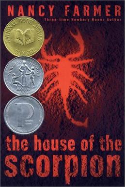
                                         

Mmmmm. Good stuff.

Anyone who knows me well knows that The House of the Scorpion is my absolute favorite book. Which is to say, I've read it at least eight times and still love now at age 21 as much I did when I first read it at age 12.

I'm not even really sure why. I mean, it's a really good book, to be sure, but I've definitely read ones that are probably 'better', at least from a critical standpoint. But....it's still my favorite. For whatever reason.

Anyways, I bring this up because recently, I received an assignment for my Illustration class to do a book cover for a published book or magazine. And I, of course, had little difficulty choosing which one I wanted to do.

Book covers are awesome things. You shouldn't judge a book by its cover, but we can't help but judge anyway. Admit it, when you are looking at books, you pick the ones with the interesting covers - the ones that stick out to you, that look intriguing, making you want to know what's inside. Plenty of excellent books have less-than-excellent covers, but we've probably never heard of them.

And the book I chose already has a pretty darn good one, if a bit generic. There's a lot of red. And red, as we all know, is the color to which all humans automatically connect, regardless of whether or not it's actually our favorite color. And scorpions are cool. Creepy, but that's the whole point. This book is geared towards tweens, who are craving heftier, darker fare than the bright and sunny children's book one normally grows up with. And House of the Scorpion, behind the cover, fit the bill perfectly.

For those not in the know, allow me to give a totally unnecessary summary of it here:

Taking place in the (presumably sort-of distant) future, in a country called Opium that lies between the United States and Mexico (now called Aztlan), Matt is a young boy who discovers that he is the clone of powerful drug lord and ruler of Opium, Matteo Alacran (referred to most often as "El Patron"). Nobody in this world is particularly fond of clones, viewing them as animals and abominations. Pretty much all clones aren't even allowed to have a real life, the law being that all clones must receive a shot at birth that stunts their intelligence. The story begins with Matt's creation, then jumps ahead to age 7 and then follows him through adolescence, as he tries to figure out who he is, or even what he is - is he even human, or is he a soulless animal? Is he going to become exactly like Matteo Alacran? Or can he become someone else? Who knows. You have to read it.

As an awkward, shy kid, this spoke to me for some bizarre reason. Maybe it was the theme of figuring out your identity, which is a pretty big part of pre-teen and teen life. Maybe it was the feeling ostracism and not being wanted, which I felt pretty profoundly at school and around strangers (even though it was mostly in my head). Maybe it was the feeling of not fitting in. Maybe it was all of these things. Regardless, it is an excellent book, and I highly recommend it to anyone, pre-teen or adult.

Which brings me to the cover.

I began with some rudimentary sketches, which I will upload someday (hopefully soon).

Contrast is a big thing for me. It's one of those concepts that I love to emulate and observe, not just in art but in life. Perhaps too much. Here, though, it seemed suitable: the contrast between El Patron and Matt, biologically and physically the same exact man, joined by their identical DNA. And yet, as the book goes one, we see that they are not inherently the same person.

(Don't ask me, just read the darn book)

So, the taller figure is El Patron - the original Matteo Alacran. He overshadows Matt, the smaller figure. Everything he does and has done dictates Matt's life. What he is going to do....well, we don't know. And we're not sure we want to find out.

While I do like this piece, I see some problems with it. It looks too simple. It catches the eye, but is a little too vague. It doesn't draw you in like it should. And besides, it doesn't have a scorpion in it. And that's just unacceptable.

I was unwilling to start all over again, though, so I kept the same image, but with a small tweak.


BAM. Scorpion. Now all the requirements are meant. I can just go on to line work and value study.

Wait, what's that? Stupid? Psh. Away with you. I am an ART MAJOR. CLEARLY I know more than you do about this sort of thing. Who are you, anyway? The audience?

......

OKAY. FINE. It's stupid. Here, let me just go all the way back to the drawing board and start ALL over again and....


Oh. Okay.That worked out.

Here, the symbolism a bit clearer. I took out the plain black-and-white contrast and overly simplistic image and replaced it with one that was a bit more personal. Two hands clasped together are often used to symbolize union, love, and connection. What El Patron and Matt have isn't exactly "love", which is where the scorpion comes in. The hands create the head of the scorpion, the stinger prominently featured in the foreground, referring to El Patron/Matteo's chosen surname, Alacran.

(It's Spanish. For scorpion. In case you missed that. Because that's easy to miss. If you don't know Spanish. Like me. I don't know Spanish. I only what 'alacran' means because I read the book.)

(Anyways......)

What the scorpion symbolizes and why it's so darn important....well, you'll just have to read the book, won't you?

(SLAP)

Okay, okay, okay, I'll stop doing that. Happy? Good. Let's move on.

(owwwww....)

I also added a little circular, stone window at the top, which....well, at risk of being cyber-slapped again, let's just say makes more sense after the story is read. As it is, it adds another source of light, which adds some of that lovely contrast which I love so much. It also makes the cover more interesting, just in general, with another shape. It...completes the aesthetic? I guess? Yes. Yes, it does.

From there, I practiced with some value:


Okay, I actually did this before the line-work one above, which is why the scorpion looks less....scorpion-y. But hey, values. I am very, very satisfied with them here. The composition needs work, of course, but it's still in the development stages here, so there's hope.

(Tip: references are AWESOME.)

(especially with scorpions)

Now....well, now I am currently working on the color comps. Here's what I have so far:


Yeeeeeah, still working on it. Please join me next week, in Part 2. 


Friday, September 19, 2014

Hello! I exist!

Hello, everyone!

My name is Laura. I love art. And so this is my art blog.

As of right now, it is in its very very basic stage and looks hideous, but I hope to change all that soon. And I invite you to watch me as I do so. Because I am awesome and all of you should love me. It's a crime, really, that you don't. So I am going to remedy that. RIGHT NOW.

....okay, that just sounded stupid. It sounded so much better in my head. Or not, because I am pretty much just spewing whatever comes into my head right now. Sorry about that.

Anyways, this is my art blog. Where I post my art. Here, look:


I painted this for a class my freshman year of college. And to this day, I am far more proud of it than I probably should be. I mean, the bubbles are not nearly as round and circular as they should be. But hey, no one's perfect. 

Anyways, here on this blog, I will post things about projects I am doing, class assignments that I feel are worthy of being posted here, and so on. Hopefully, this will help me gain more feedback on how I can improve from my fellow human beings, and also motivate me to get myself more 'out there' as I pursue a career in the fiercely competitive and often bizarre field of commercial (and maybe even occasionally fine) art. So, more to come. ONWARDS.